
This should really be a 2,000 word editorial, but because I like to keep this site a somewhat easy read, I won’t say too much.
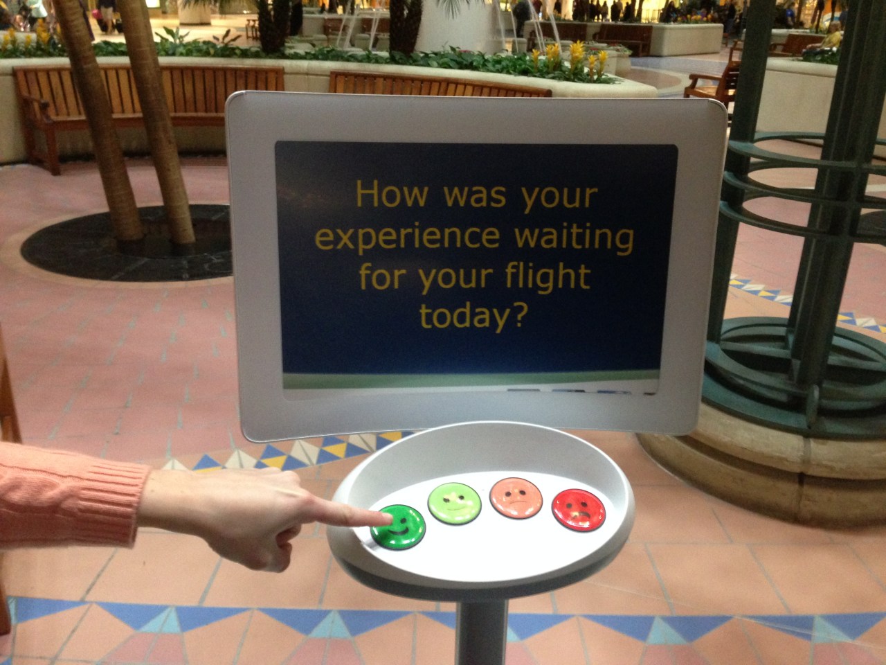
Orlando International Airport has resorted to emojis to attract customer feedback. Sure, these buttons are much easier to press than filling out an entire survey, but I guarantee you the information gained from this stand is entirely useless. An airport has far too many disparate conditions that can cause dissatisfaction with passengers. Furthermore, a bad score offers the airport operator no way to know what to improve. Was the wait for the monorail too long? Or maybe there was vomit all over the bathrooms in the terminal. This kiosk can’t even determine if the passenger is upset because their flight was delayed or their girlfriend was run over by a rental car in the parking lot.
The one thing this kiosk provides is a way to be understood by absolutely anybody. Sometimes I would call that good design, but here, it’s simply useless. What is the distinction? Good design requires two main components- functionality and usability. A product can be entirely functional, but completely unusable (*cough* Microsoft Excel), or fully usable but nonfunctional (*cough* Yik Yak). This kiosk is very easy to understand and use, but provides no functional information to the airport.
Can I offer a suggestion to the execs at MCO? No? Okay, I will anyway. Put iPads on the monorail so that the captive audience traveling to and from their gates can provide input. This will segregate feedback into “departing” and “arriving” surveys, allowing the airport to immediately distinguish which side of the airport needs to be improved.
That would be good design, and I love good design. Hopefully this can become a series highlighting both good and bad design.
